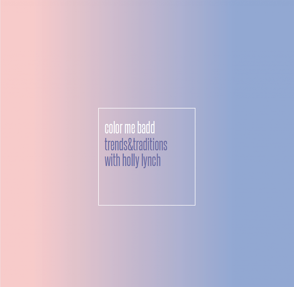
Rose Quartz and Serenity have officially been named the colors of the year. As you know, I’m normally full of excitement about the announcement of Pantone’s color of the year. Pantone, the world leader of international color standardization, is usually right on the money with their color selections. The last two years featured colors like Emerald (2014) and Marsala (2015). Both colors became part of the events we created, reinforcing the popularity of Pantone’s prediction.
This year, I have my doubts. Pantone, apparently, had doubts as well, which might explain why they’ve chosen two colors. In their press release, they intend the colors to be a gradient of the two tones, blended together. They even state that the blended colors represent society’s acceptance of gender as a more fluid concept as well as a younger generation that doesn’t require being typecast in a certain manner.
So, why exactly did Pantone choose baby blue and pastel pink? If ever there were two colors that screamed traditional, it’s these two colors.
When I first saw the colors, I was remind-ed of a sofa my parents had during my middle and high school years (late 80s, early 90s). It was a watercolor blend of pink, blue and a little teal green. After a few years, that sofa was outdated, much like “Miami Vice” and big hair. Those pastel watercolors came and went very quickly.
My second thought on seeing the col-ors Pantone selected was of a very specific gender declaration – the pregnant couple’s much-anticipated (and newly invented) gen-der reveal party. If you aren’t aware of these little events, let me explain. When a couple discovers they are expecting a baby, after enough gestational months have passed, the couple asks the ultrasound technician or doctor to list the gender of the baby in some discreet way or only tell the mother or the father. Then, the knowing party invites friends and family to a designated location, and “reveals” the gender of the expected child in some grand way (think pink or blue balloons coming from a box, or cutting into a cake where the batter has been dyed one color of the other). In this way, everyone at the event can find out the gender of the baby at one time. Fabulous photos are then posted on all social media channels with a great big “It’s a ___!” as the headline.
While I’m a huge fan of celebrating any occasion that can get the family together, the gender reveal party still amuses me. I haven’t figured out if this event is a fad or something I’ll be planning as part of our repertoire of events in the future.
Since I’m usually such a fan of Pantone’s color selection, I’m particular disappointed in this year’s choice. The fact that there are two colors, blended together, just frustrates me. Personally, I think the blend of these two colors looks like fog.
While I do like gradients, I tend to like them better when they are a blend of similar colors (ombré). Like the much maligned red cup from Starbucks (it was a red gradient – not sure how many noticed that?), a gradient of two shades of the same tone can actually be soothing. Two diverse colors blended together can often yield poor results. I recall mixing my water color paints as a child and every color becoming a murky, muddy brown.
In trying to find a kind thing to say about this whole situation, I thought I would try to discern how I feel about these colors individually.
Rose Quartz is actually a pretty pink. It’s pale without being too babyish, and there’s a hint of peach and gold to it (in my opinion). I would almost call it blush, but rose quartz is darker than blush. This color is great for weddings as it’s very traditional. And roses are quite beautiful in this shade of pink (it’s called rose after all).
Serenity, on the other hand, doesn’t do anything for me. Nothing. It’s periwinkle with a catchy new name. It’s not quite blue, not quite purple. It’s hazy. I am not serene when I see that color. I’m reminded of George Costanza’s father on “Seinfeld” yelling, “Serenity now!” as an antidote for daily frustrations. That’s how Serenity makes me feel.
From all this discussion, I realize that look-ing forward to Pantone’s announcement of the color of the year is a hold-over from my previous career. I was a graphic designer and marketing executive for a consumer product company, where I enjoyed membership in an organization called Color Marketing Group. Literally, folks got together twice a year to predict color trends. I participated on a few occasions and the process was very interesting.
Now, however, I just need to wait until a few brides come through the door and tell me what colors they want to use in their weddings; then, I can see what the trend will be. As a side note, Color Marketing Group’s December color of the month looks strikingly similar to Rose Quartz. For this past year, I did in fact see lots of Marsala. And often, it was paired with a pale pink. So, if Serenity starts showing up more than a few times this year, then maybe I’ll come around. In the meantime, I’ll stick with my favorite shade of green.
Holly Lynch is the owner of The Season Events, a full service catering, event planning and design company located at 300 Glenn Milner Blvd. in Rome.
*The views expressed in this column are those of the writer, and do not represent the opinions of V3 Magazine.